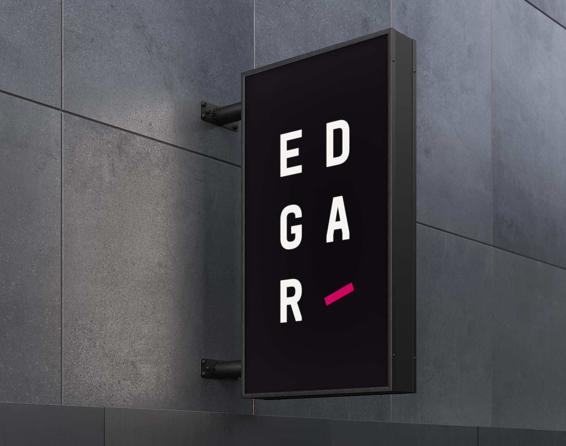
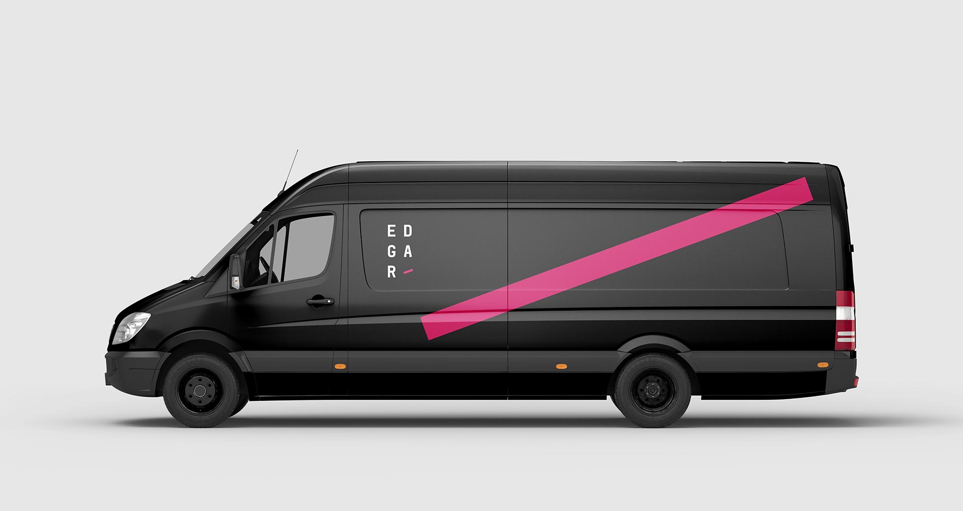
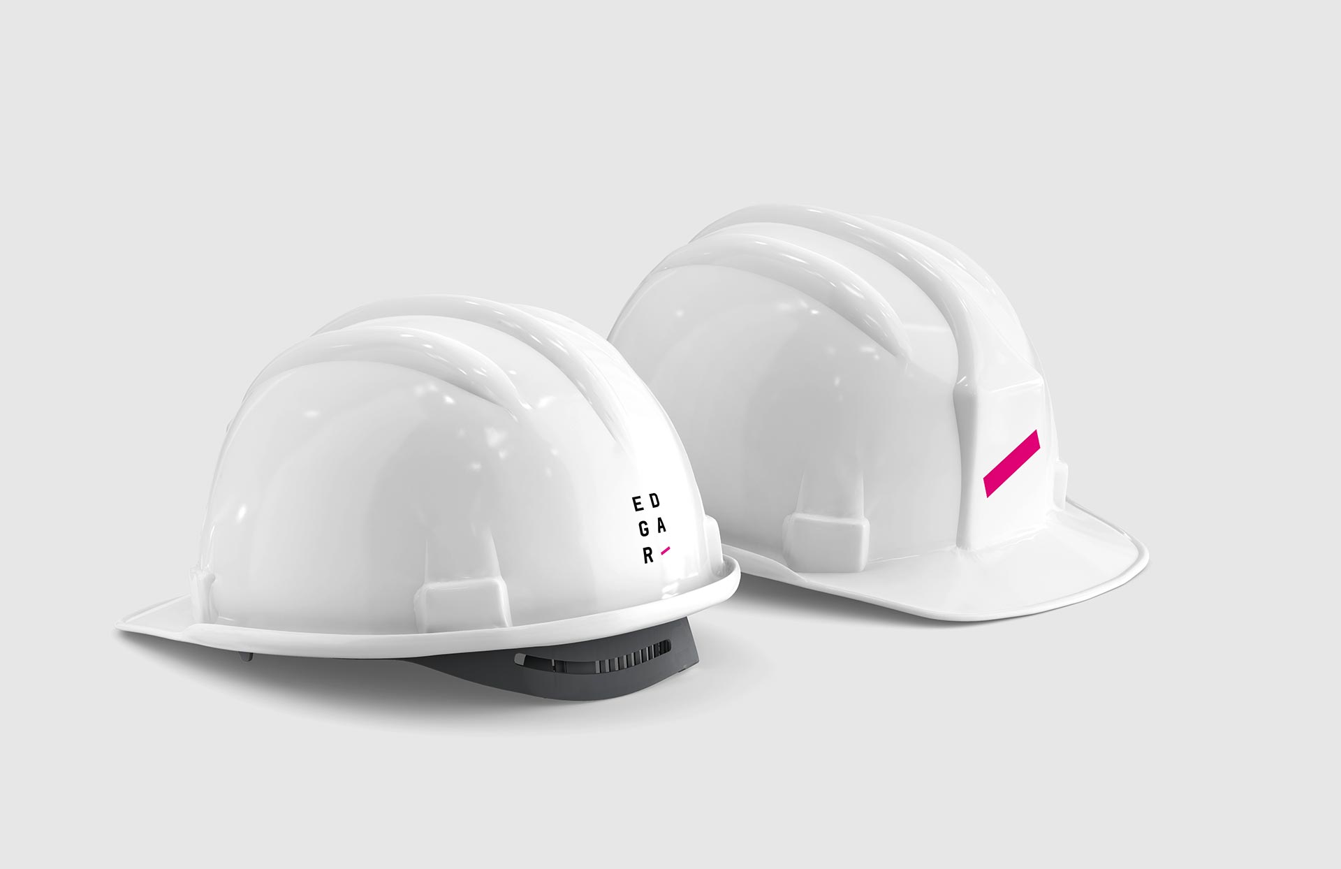
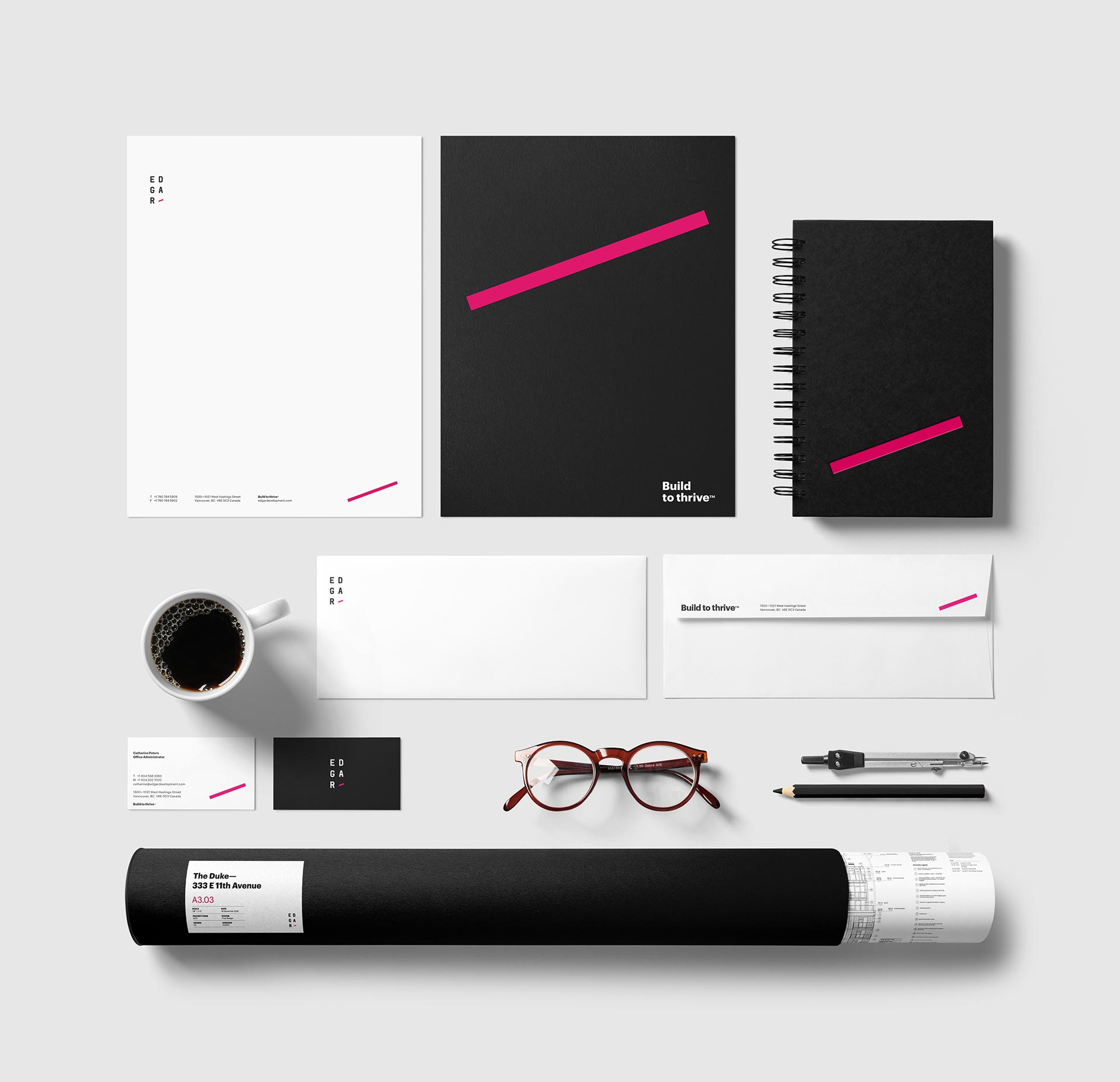
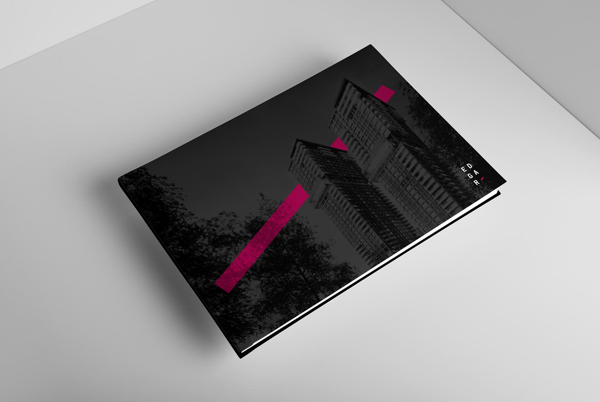
EDGAR
vs
The Ordinary

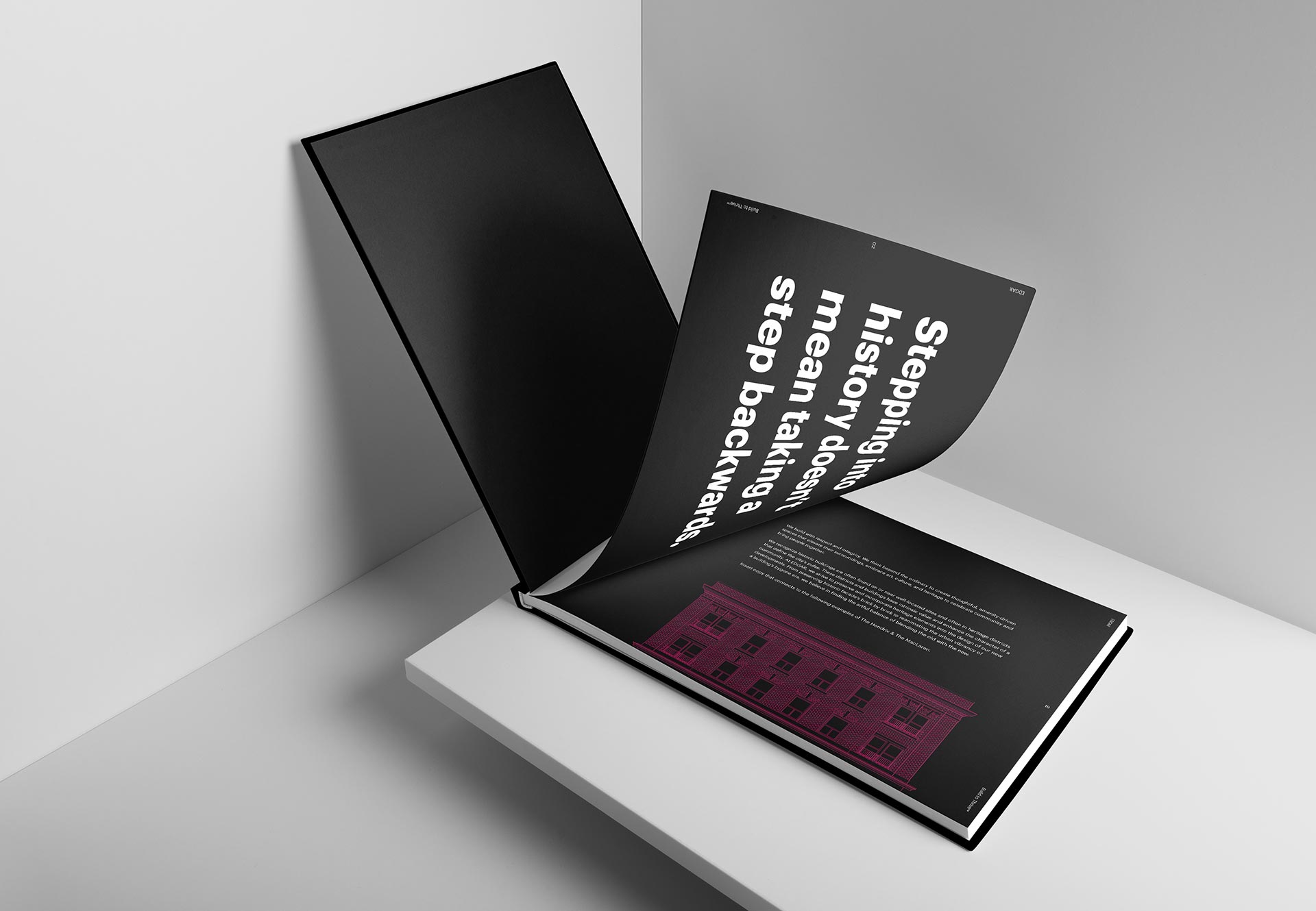
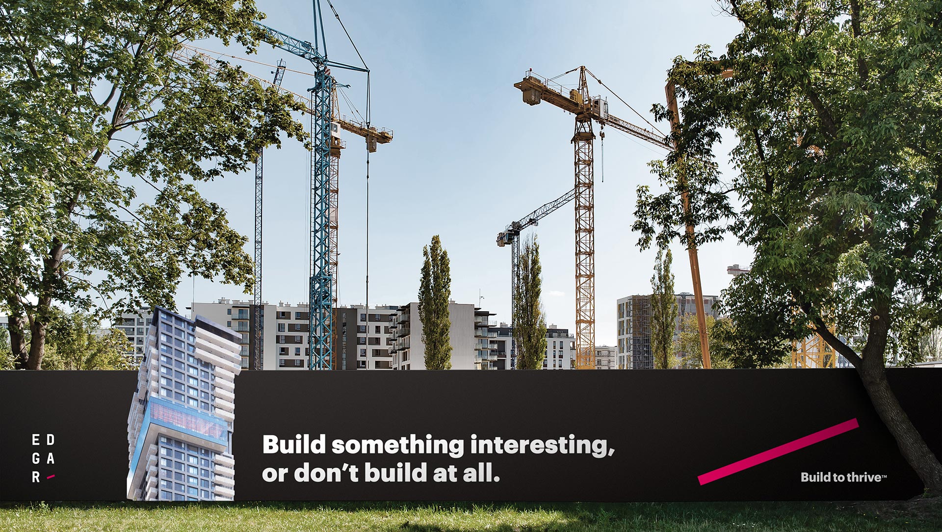
EDGAR’s youthful, informal, and non-traditional approach to development required a brand that lived up to its name. Because EDGAR builds with purpose, quality and care, they are making a long-term impact on stakeholders and all those who call EDGAR home.

  • Brand Identity
  • Brand Strategy
  • Content Production
  • Print Production

Tale of the tape.

EDGAR is not an ordinary real estate developer. They look beyond what they build to focus on long-term impact, not short-term gains. EDGAR’s philosophy is to create something interesting or not at all. Not only do their buildings stand out, but the communities around them thrive too. That’s how Build to Thrive became the strategic platform for developing a brand identity as distinctive as the company.

Creative knockout.

The new EDGAR identity makes a bold statement in a traditional category. The line in the logo represents growth and is a subtle reminder of how long-term focus can truly create better outcomes for investors and those who call EDGAR home. Stacked lettering provides a fresh take on an established industry by symbolizing the form of a building. And the pop of colour in the line accentuates EDGAR’s infectious creative energy and passion for everything they do.

The Full Punch team captured the heart and soul of our company and reflected it through every touchpoint. The way we act, how we look and feel and our internal culture are all united by our new brand.